Defining your purpose
First, define the purpose of the dashboard. When creating a dashboard, start by clarifying the specific goals and objectives you want to achieve. Are you designing the dashboard to monitor key performance indicators (KPIs), track progress toward goals, or identify trends and patterns? Here are four dashboard categories to help you characterize the purpose of yours:- Operational – use it to monitor, measure, and manage operations on a more immediate or shorter timescale.
- Strategic – use it to analyze data based on trends and for long-term business strategies.
- Tactical – use it to formulate strategies based on your data insights.
- Analytical — use it to display large amounts of data.
Identify your target audience
Who will view and use the dashboard for decision-making? What is their level of familiarity with data? Make sure to tailor the design and complexity of the dashboard to match your audience’s needs and analytical skills.Focus on relevant metrics
It’s easy to display all your data on the dashboard, but that may not be an effective way of telling your story. Include only the metrics that align with your dashboard’s purpose and objectives. Avoid cluttering the dashboard with unnecessary information and insights.Use appropriate charts and graphs
Bar charts, line graphs, and pie charts are commonly used data visualizations, but you need to make sure you choose the most suitable one for the data you are visualizing. For example, if you want to show a geographical representation of data, one appropriate option is a heat map visualization. A bar or column chart will work best if you want to compare two or more data values. A histogram is ideal if you want to perform a range analysis of data according to a specific frequency.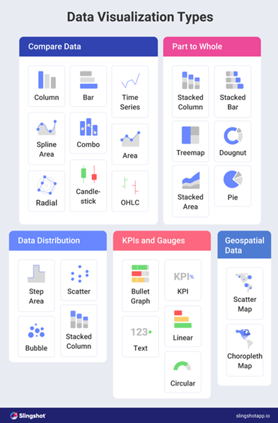
Tell a data story
Provide context that explains your chart to your audience. Use descriptive and concise titles, annotations, and captions to guide the audience through trends, anomalies, and key insights. Additionally, sorting the dashboard’s content appropriately enhances its usability and helps convey the intended message effectively. For example, if your dashboard includes categories on the x-axis, sorting the data alphabetically can be beneficial, while sorting the data in ascending order is recommended when the objective is to highlight and emphasize the story of growth or progression.Enable interactive capabilities
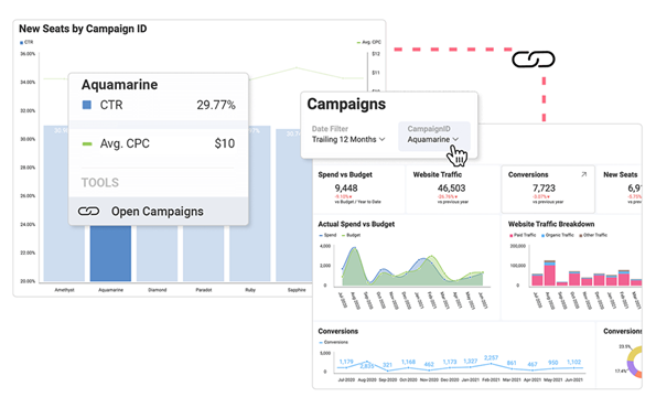
Allow users to explore data on a deeper level and uncover hidden insights by incorporating different dashboard interactive elements such as dashboard linking and drill down. Dashboard linking capability connects different dashboards or visualizations together to provide a more comprehensive and detailed view of the data. The drill-down capability allows users to navigate from a high-level summary or overview dashboard to more detailed levels of information.