Custom Software Development
Web Development
Testing and QA
UI/UX Design
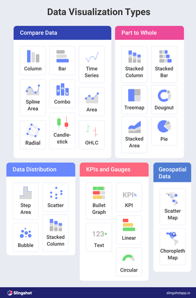
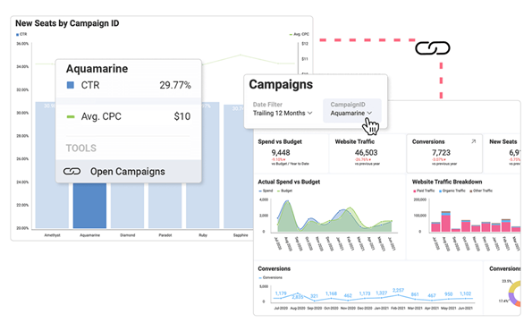
Business Intelligence
Artificial Intelligence Services
IT Consulting
Data Science
Machine Learning
Big Data
Internet of Things (IoT)
DevOps Consulting Services